Analogous Colors Explained: Color Wheel Theory for Web Design
If you've ever looked at a sunset and thought "those colors just work together," you've already experienced analogous colors in action. The oranges bleeding into reds bleeding into pinks — that's not random. It's color harmony baked into how the visible spectrum operates, and it's one of the most reliable tools you have when designing for the web.
I've been building websites for over a decade, and analogous color schemes are my go-to when a client says "I want something that feels cohesive but not boring." They're forgiving, they're flexible, and they're surprisingly hard to screw up. Let me walk you through exactly how they work and how to put them to use.
Table of Contents
- What Are Analogous Colors?
- How Analogous Colors Work on the Color Wheel
- Color Harmony Theory: Why Analogous Schemes Feel Right
- Analogous vs Complementary Colors
- Analogous Color Palettes for Websites
- How to Build an Analogous Color Scheme in CSS
- Real-World Examples of Analogous Colors in Web Design
- Common Mistakes and How to Avoid Them
- FAQ
What Are Analogous Colors?
Analogous colors are groups of three to five colors that sit next to each other on the color wheel. That's really the whole definition. Pick any color, then look at its immediate neighbors — those are your analogous colors.
For example:
- Blue, blue-green, green — analogous
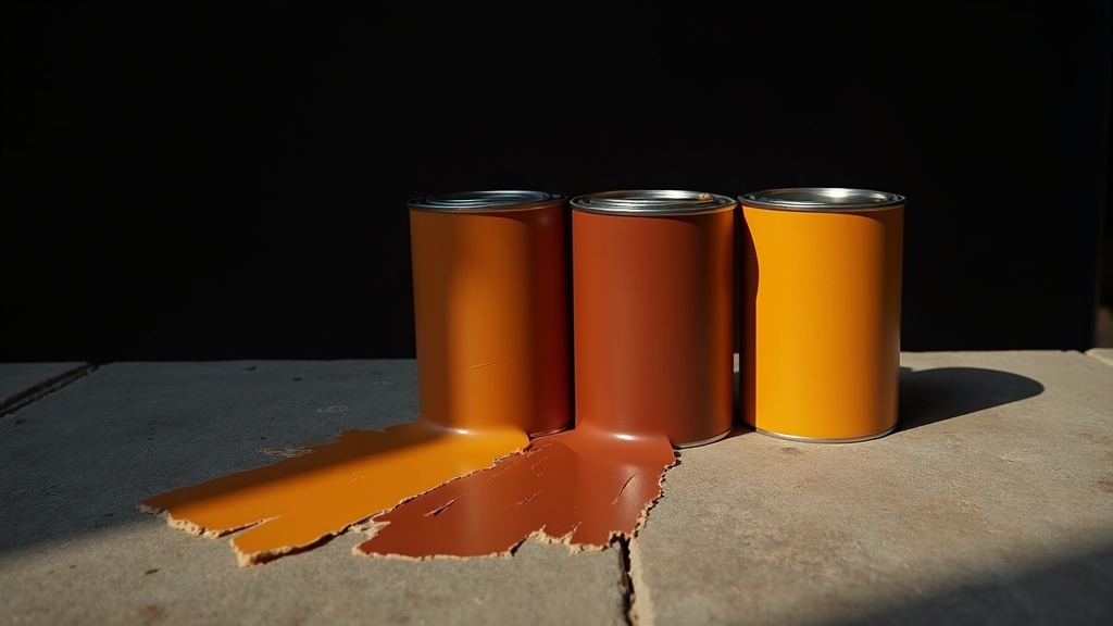
- Red, red-orange, orange — analogous
- Yellow, yellow-green, green — analogous
The key characteristic is adjacency. These colors share underlying pigment wavelengths, which is why they look like they belong together. There's no jarring contrast, no visual tension. Just smooth, natural transitions.
Most color theorists define an analogous scheme as colors within 30° to 60° of each other on a standard 12-hue color wheel. Some extend this to 90°, but once you go beyond that, you're starting to lose the "family resemblance" that makes analogous schemes special.
The 60-30-10 Rule
When working with analogous colors, the classic distribution rule applies beautifully:
- 60% — Your dominant color (usually the middle hue)
- 30% — Your secondary color (one neighbor)
- 10% — Your accent color (the other neighbor)
This ratio prevents the palette from looking flat. Without it, you get a mushy, indistinct wash of similar tones. With it, you get hierarchy and visual interest.
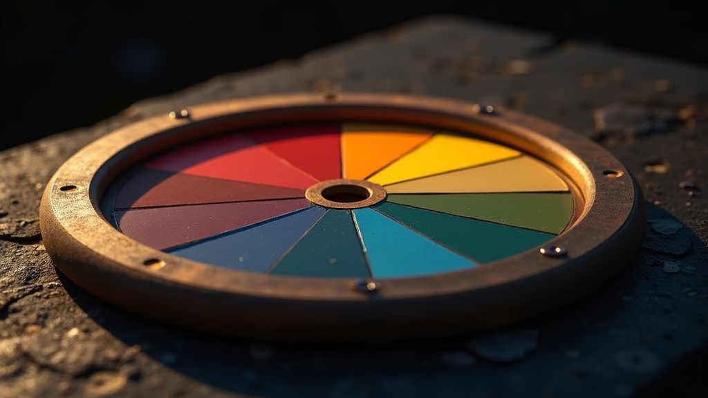
How Analogous Colors Work on the Color Wheel
The color wheel is a circular arrangement of hues based on their chromatic relationship. Sir Isaac Newton created the first one in 1666, and designers have been using variations of it ever since. The standard artist's color wheel has 12 hues:
| Position | Color | Hue Degree |
|---|---|---|
| 1 | Red | 0° |
| 2 | Red-Orange | 30° |
| 3 | Orange | 60° |
| 4 | Yellow-Orange | 90° |
| 5 | Yellow | 120° |
| 6 | Yellow-Green | 150° |
| 7 | Green | 180° |
| 8 | Blue-Green | 210° |
| 9 | Blue | 240° |
| 10 | Blue-Violet | 270° |
| 11 | Violet | 300° |
| 12 | Red-Violet | 330° |
An analogous scheme picks any starting point and grabs its neighbors. If you start at Blue (240°), your analogous palette might include Blue-Green (210°) and Blue-Violet (270°). You can try this yourself with our interactive color wheel tool — select the analogous harmony mode and rotate to see how the relationships shift.
Warm vs Cool Analogous Palettes
One thing that makes analogous schemes powerful is that they naturally fall into warm or cool territories:
- Warm analogous: Red through Yellow (0°–120°). These palettes feel energetic, inviting, and urgent.
- Cool analogous: Green through Violet (150°–300°). These feel calm, professional, and trustworthy.
This temperature consistency is actually a feature, not a bug. It means your entire palette carries a unified emotional tone, which is incredibly useful for brand design and UI work.
Color Harmony Theory: Why Analogous Schemes Feel Right
Color harmony isn't just aesthetic preference — there's actual perceptual science behind it. The human visual system processes color through three types of cone cells (short, medium, and long wavelength). Analogous colors stimulate overlapping sets of these cones, which is why our brains interpret them as "belonging together."
Johannes Itten, the Bauhaus color theorist, identified seven types of color contrast in his 1961 work The Art of Color. Analogous schemes primarily exploit what he called contrast of hue at its lowest intensity. There's just enough difference to create visual interest, but not so much that it creates tension.
The Three Types of Color Harmony
There are fundamentally three categories of color harmony, and understanding where analogous fits helps you choose the right approach:
- Related harmonies (analogous, monochromatic) — Low contrast, high cohesion
- Contrasting harmonies (complementary, split-complementary) — High contrast, high energy
- Complex harmonies (triadic, tetradic) — Balanced contrast, harder to execute
Analogous sits in that first category. It's the harmony of similarity. And in web design, where users are processing information quickly and you don't want color fighting with content, that similarity is often exactly what you need.
Analogous vs Complementary Colors
This is the comparison everyone asks about, and for good reason — they're opposite philosophies.
| Aspect | Analogous | Complementary |
|---|---|---|
| Wheel relationship | Adjacent (30°–60° apart) | Opposite (180° apart) |
| Visual effect | Harmonious, unified | High contrast, vibrant |
| Emotional tone | Calm, cohesive | Dynamic, energetic |
| Difficulty to use | Easy | Medium |
| Best for | Backgrounds, content-heavy sites | CTAs, attention-grabbing elements |
| Risk | Can feel monotonous | Can feel chaotic |
| Nature example | Autumn leaves (red-orange-yellow) | A red cardinal on a green branch |
Here's my honest take: most websites benefit from an analogous base palette with one complementary accent. This gives you the cohesion of analogous harmony with a pop of contrast where you need it — like on buttons, alerts, or key UI elements.
For instance, if your site uses a blue-teal-green analogous scheme, a single orange CTA button will absolutely sing against that background. You get the best of both worlds.
When to Choose Analogous Over Complementary
- Content-first sites (blogs, documentation, news): Analogous keeps the focus on reading
- Portfolio sites: Analogous lets the work speak without competing colors
- Healthcare and wellness brands: The calm of analogous matches the brand tone
- SaaS dashboards: Users stare at these for hours; lower contrast reduces fatigue
When to Choose Complementary Instead
- E-commerce: You need that contrast to drive conversions
- Entertainment brands: Energy and excitement matter more than calm
- Single-page landing pages: You're fighting for attention in seconds
Analogous Color Palettes for Websites
Let me give you five battle-tested analogous palettes I've actually used on real projects. Each includes hex codes, suggested roles, and the emotional vibe they create.
Palette 1: Ocean Depth (Cool Professional)
:root {
  --primary: #1B4D6E;    /* Deep blue — dominant */
  --secondary: #2E8B8B;  /* Teal — secondary */
  --accent: #3DAD9E;     /* Seafoam — accent */
  --surface: #F0F7F7;    /* Tinted white — backgrounds */
  --text: #1A2332;       /* Near-black — body text */
}
Best for: SaaS products, fintech, corporate sites. This palette says "we're serious but not boring."
Palette 2: Golden Hour (Warm Inviting)
:root {
  --primary: #D4764E;    /* Burnt orange — dominant */
  --secondary: #E8A94E;  /* Amber — secondary */
  --accent: #F0C75E;     /* Gold — accent */
  --surface: #FFF8F0;    /* Warm white — backgrounds */
  --text: #2D1F14;       /* Dark brown — body text */
}
Best for: Food and beverage, hospitality, lifestyle brands. Warm and inviting without being aggressive.
Palette 3: Forest Floor (Natural Organic)
:root {
  --primary: #4A7C59;    /* Forest green — dominant */
  --secondary: #7BA05B;  /* Sage — secondary */
  --accent: #A8BF6A;     /* Lime — accent */
  --surface: #F5F7F0;    /* Green-tinted white — backgrounds */
  --text: #1C2B1F;       /* Deep green-black — body text */
}
Best for: Sustainability brands, outdoor companies, wellness. This one screams "we care about the planet" without literally saying it.
Palette 4: Twilight (Sophisticated Cool)
:root {
  --primary: #5B4A8A;    /* Deep purple — dominant */
  --secondary: #7B5EA7;  /* Lavender — secondary */
  --accent: #9B72C1;     /* Orchid — accent */
  --surface: #F5F2FA;    /* Violet-tinted white — backgrounds */
  --text: #1E1528;       /* Near-black purple — body text */
}
Best for: Creative agencies, beauty brands, premium products. Purple analogous palettes always feel a bit luxurious.
Palette 5: Sunrise (Energetic Warm)
:root {
  --primary: #C23B22;    /* Rich red — dominant */
  --secondary: #D96830;  /* Burnt sienna — secondary */
  --accent: #E8973E;     /* Tangerine — accent */
  --surface: #FEF6F0;    /* Peach-tinted white — backgrounds */
  --text: #2A1510;       /* Dark chocolate — body text */
}
Best for: Food delivery, fitness, entertainment. High energy but still cohesive.
Play with these as starting points on our color wheel tool to find variations that match your specific brand.
How to Build an Analogous Color Scheme in CSS
Here's where things get practical. Modern CSS makes it trivially easy to build and maintain analogous color schemes using HSL (Hue, Saturation, Lightness) values.
The beauty of HSL for analogous schemes is that you only need to shift the hue value. Saturation and lightness stay similar, and the hue rotates by 30° increments.
:root {
  /* Base hue: 200 (a nice cerulean blue) */
  --hue-primary: 200;
  --hue-secondary: 170;  /* -30° = teal direction */
  --hue-accent: 230;     /* +30° = violet direction */

  /* Build the palette */
  --color-primary: hsl(var(--hue-primary), 65%, 42%);
  --color-secondary: hsl(var(--hue-secondary), 55%, 48%);
  --color-accent: hsl(var(--hue-accent), 60%, 52%);

  /* Light variants for backgrounds */
  --color-primary-light: hsl(var(--hue-primary), 40%, 95%);
  --color-secondary-light: hsl(var(--hue-secondary), 35%, 93%);

  /* Dark variants for text */
  --color-primary-dark: hsl(var(--hue-primary), 70%, 15%);
}
This approach has a huge advantage: you can shift your entire palette by changing a single variable. Need to go from blue-based to green-based? Change --hue-primary from 200 to 150 and the whole system recalculates.
Using oklch() for Perceptually Uniform Analogous Palettes
If you want to go a step further, the CSS oklch() color function (supported in all major browsers since 2023) gives you perceptually uniform color spacing. This means a 30° hue shift looks like the same amount of change regardless of where you are on the wheel — something HSL can't guarantee.
:root {
  --primary: oklch(55% 0.15 230);     /* Blue */
  --secondary: oklch(55% 0.15 200);   /* Teal */
  --accent: oklch(55% 0.15 260);      /* Indigo */
}
Same lightness, same chroma, just rotating the hue. The result is an analogous palette that feels mathematically balanced and visually even. I've started using this on all new projects, and the difference is noticeable.
Real-World Examples of Analogous Colors in Web Design
Let's look at how real brands use analogous color schemes:
Spotify
Spotify's primary green (#1DB954) is surrounded by darker greens and near-blacks. It's essentially a monochromatic-to-analogous scheme with green as the anchor. The entire interface feels unified, and the green pops against dark surfaces without needing a complementary color.
Headspace
The meditation app uses a warm analogous palette of oranges and yellows against soft whites. It immediately communicates warmth, calm, and positivity — exactly the brand's intent. No competing cool tones.
Stripe
Stripe's website uses a cool analogous gradient that shifts from blue to purple to pink. It's technically stretching the definition (those colors span about 120° of the wheel), but the gradient keeps the transitions smooth. The result feels modern and slightly futuristic.
Dropbox (2017 Rebrand)
Dropbox went with an analogous blue-purple scheme that was widely discussed in the design community. The palette choice reinforced their shift from "storage utility" to "creative workspace." Whether you loved it or hated it, the color strategy was deliberate.
If you're building a site with these kinds of palettes, working with a team that understands design systems makes a real difference. Our headless CMS development approach lets designers define color tokens that cascade across every component — so your analogous scheme stays consistent from header to footer.
Common Mistakes and How to Avoid Them
Mistake 1: Not Enough Contrast
The biggest problem with analogous schemes is that everything can look the same. If your three colors are too similar in saturation and lightness, they'll bleed together.
Fix: Vary the lightness values significantly. Your dominant color might be at 40% lightness, your secondary at 55%, and your accent at 70%.
Mistake 2: Forgetting About Accessibility
Analogous colors, by definition, are close together. This means they can fail WCAG contrast requirements when placed next to each other.
Fix: Never rely on two analogous hues alone to communicate meaning. Always pair them with sufficient value contrast (light vs. dark). Text should be tested against backgrounds — aim for at least 4.5:1 contrast ratio for body text.
/* BAD: Two analogous colors with similar lightness */
.card {
  background: hsl(200, 60%, 50%);  /* Medium blue */
  color: hsl(170, 55%, 45%);       /* Medium teal — fails contrast */
}

/* GOOD: Analogous hue with high lightness contrast */
.card {
  background: hsl(200, 30%, 95%);  /* Very light blue */
  color: hsl(200, 70%, 20%);       /* Very dark blue — passes */
}
Mistake 3: Using Too Many Colors
Five analogous colors rarely work better than three. The more colors you add, the harder it is to maintain visual hierarchy.
Fix: Stick to three hues maximum. Generate your extended palette through lightness and saturation variations of those three, not by adding more hues.
Mistake 4: Ignoring Neutral Colors
A pure analogous scheme with no neutrals looks like a paint store explosion. Every good palette needs breathing room.
Fix: Add warm or cool grays that lean toward your dominant hue. A blue analogous scheme should use blue-gray neutrals, not pure gray.
For projects built on modern frameworks like Next.js or Astro, we typically define these palettes as design tokens in a central config file. This makes it trivial to adjust the entire scheme during design reviews without hunting through dozens of component files.
FAQ
What are analogous colors in simple terms? Analogous colors are any group of colors that sit right next to each other on the color wheel. Think of them as color neighbors — they share common underlying tones and naturally look good together. Red, red-orange, and orange are analogous. Blue, blue-green, and green are analogous. You can explore these relationships hands-on with our color wheel tool.
How many colors are in an analogous color scheme? Typically three, though you can use as few as two or as many as five. Three is the sweet spot for web design because it gives you a dominant, secondary, and accent color without overwhelming the layout. Going beyond three makes it harder to maintain contrast and hierarchy.
What is the difference between analogous and complementary colors? Analogous colors are neighbors on the color wheel (30°–60° apart), creating a harmonious, low-contrast feel. Complementary colors are directly opposite each other (180° apart), creating maximum contrast and visual tension. Analogous is the harmony of similarity; complementary is the harmony of opposition. Most great web designs use an analogous base with a complementary accent.
Are analogous colors warm or cool? They can be either, but any single analogous palette will be consistently warm OR cool — never both. That's because adjacent colors on the wheel share temperature. A palette from yellow through orange to red is warm. A palette from blue through blue-green to green is cool. This consistency is one of the reasons analogous schemes feel so unified.
What are some examples of analogous colors in nature? Nature is full of analogous harmony. A sunset shifts from yellow to orange to red to pink. Autumn foliage moves through yellows, oranges, and reds. A patch of moss shows yellow-green to green to blue-green. Peacock feathers display blue to teal to green. Designers have been cribbing from nature's palette since long before color theory was formalized.
How do I create an analogous color palette for my website? Start with your brand's primary color. Find it on the color wheel, then select the colors 30° on either side. Assign the 60-30-10 ratio: 60% primary, 30% secondary, 10% accent. Add a near-white tinted background and a near-black tinted text color. Test for WCAG accessibility contrast. Our color wheel tool generates these palettes automatically if you want a quick starting point.
Can analogous colors be used for dark mode web design? Absolutely. The hue relationships stay the same — you just invert the lightness values. Where light mode uses light backgrounds (95% lightness) and dark text (15% lightness), dark mode flips to dark backgrounds (10-15% lightness) and light text (85-90% lightness). Keep your analogous hues for accent colors and interactive elements, and use darkened versions of the same hues for surfaces.
Do analogous color schemes work for e-commerce websites? They work well as a base palette, but pure analogous schemes can be too calm for e-commerce where you need urgency and clear CTAs. The best approach is an analogous foundation with a single complementary accent for buttons and sale badges. For example, a green-teal analogous palette with a red "Add to Cart" button creates instant visual hierarchy through contrast. If you're planning a headless e-commerce build, get in touch — color strategy is part of our design process.