Split-Complementary Colors Explained: The Best Beginner Color Scheme
I've been building websites for over a decade, and if there's one thing that separates amateur designs from professional ones, it's color. Not the number of colors you use — it's which colors you use together and why. Most developers I know (myself included, early on) either stick to safe grays and one accent color, or they pick colors that feel right in the moment but look muddy in production.
The fix isn't learning color theory from a 400-page textbook. It's learning one reliable color scheme and using it until it's second nature. That scheme, for my money, is split-complementary. And once you're comfortable with it, triadic colors are the natural next step. Let me walk you through both.
Table of Contents
- What Are Split-Complementary Colors?
- How to Find Split-Complementary Colors on the Color Wheel
- Why Split-Complementary Is Perfect for Beginners
- Split-Complementary Colors in CSS
- Real Web Design Examples Using Split-Complementary
- What Are Triadic Colors?
- Split-Complementary vs Triadic: When to Use Each
- Practical Tips for Applying Color Harmonies
- FAQ
What Are Split-Complementary Colors?
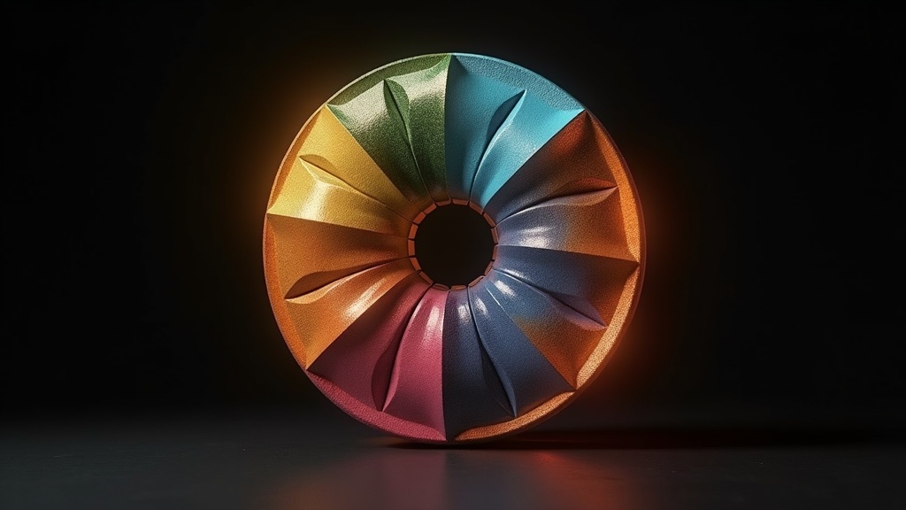
Let's start with plain complementary colors. On a standard color wheel, complementary colors sit directly opposite each other — think blue and orange, red and green, purple and yellow. They create maximum contrast. The problem? Maximum contrast can feel aggressive. A blue-and-orange website screams at you. It's the design equivalent of an argument.
Split-complementary takes that idea and softens it. Instead of using the color directly opposite your base color, you use the two colors adjacent to the complement. So if your base color is blue, the complement would be orange. But instead of orange, you'd pick yellow-orange and red-orange.
That's it. That's the whole concept.
The result is a three-color palette that has strong visual contrast (because you're still pulling from the opposite side of the wheel) but feels more nuanced and less confrontational. You get tension without conflict.
The Geometry Behind It
On a 360-degree color wheel:
- Pick your base hue (e.g., 220° for a rich blue)
- Find the complement: base + 180° (so 40°, which is orange)
- Instead of 40°, go 30° to either side: 10° (red-orange) and 70° (yellow-orange)
The standard split is ±30° from the complement, though some designers use ±25° or ±35° for slightly different feels. There's no hard rule — your eyes are the final judge.
How to Find Split-Complementary Colors on the Color Wheel
You can do this manually with HSL values, which is what I recommend for developers because it maps directly to CSS. Here's the mental model:
Base:         H
Complement:   H + 180°
Split 1:      H + 150°
Split 2:      H + 210°
Wait — why 150° and 210° instead of the complement ±30°? Same thing, different way to calculate it. (H + 180) - 30 = H + 150 and (H + 180) + 30 = H + 210. It's the same positions on the wheel.
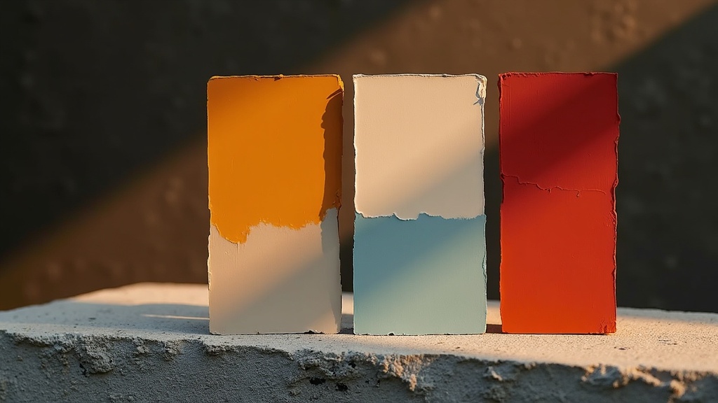
Let's say your brand color is a teal at hsl(175, 65%, 45%):
- Base: 175°
- Split 1: 175 + 150 = 325° (a rose/magenta)
- Split 2: 175 + 210 = 385° → 25° (a warm coral/orange)
Your three-color palette: teal, rose, and coral. That's a gorgeous combination, and you didn't need any design intuition to get there — just arithmetic.
Try it yourself with our interactive color wheel. Pick any base color and it'll calculate both splits instantly.
Why Split-Complementary Is Perfect for Beginners
I recommend split-complementary to every developer who asks me about color, and here's why:
It's Almost Impossible to Mess Up
Complementary schemes can look garish. Analogous schemes (colors next to each other on the wheel) can look washed out and lack contrast. Triadic schemes require careful balancing. But split-complementary? It just... works. The geometric relationship between the three colors guarantees enough contrast for visual hierarchy without the harshness of direct complements.
It Gives You a Clear Dominant Color
With triadic colors, all three hues are equally spaced, which can make it hard to decide which one leads. In a split-complementary scheme, one color is clearly the base, and the other two play supporting roles. This maps perfectly to web design where you need:
- A primary brand color (the base)
- An accent color for CTAs and interactive elements (one split)
- A secondary accent for highlights, badges, or hover states (the other split)
It Scales Down Gracefully
On some pages, you might only use two of the three colors. That still works because each split has good contrast with the base on its own. You're not locked into using all three everywhere.
Split-Complementary Colors in CSS
Here's how I typically set up a split-complementary palette using CSS custom properties with HSL. HSL is the key here — it makes color theory calculations trivial because the hue is just a degree on the wheel.
:root {
  /* Base hue */
  --hue-base: 220; /* Rich blue */
  --hue-split-1: calc(var(--hue-base) + 150); /* ~10° warm red-orange */
  --hue-split-2: calc(var(--hue-base) + 210); /* ~70° golden yellow */

  /* Primary palette */
  --color-primary: hsl(var(--hue-base), 65%, 50%);
  --color-accent-warm: hsl(var(--hue-split-1), 70%, 55%);
  --color-accent-cool: hsl(var(--hue-split-2), 60%, 50%);

  /* Extended palette — lighter/darker variants */
  --color-primary-light: hsl(var(--hue-base), 65%, 90%);
  --color-primary-dark: hsl(var(--hue-base), 65%, 25%);
  --color-accent-warm-light: hsl(var(--hue-split-1), 70%, 92%);
  --color-accent-cool-light: hsl(var(--hue-split-2), 60%, 90%);

  /* Neutrals derived from base hue */
  --color-bg: hsl(var(--hue-base), 10%, 98%);
  --color-surface: hsl(var(--hue-base), 8%, 100%);
  --color-text: hsl(var(--hue-base), 15%, 15%);
  --color-text-muted: hsl(var(--hue-base), 10%, 45%);
}
Notice those neutrals at the bottom. I'm tinting the whites and grays with a tiny amount of the base hue's saturation. This is a small detail that makes a huge difference — your backgrounds won't feel disconnected from your color palette. It's the kind of thing you don't consciously notice, but your eyes do.
Applying the 60-30-10 Rule
The classic interior design ratio works perfectly here:
/* 60% — Primary/neutral (backgrounds, large surfaces) */
.page-wrapper {
  background-color: var(--color-bg);
  color: var(--color-text);
}

/* 30% — Base color (headers, nav, cards) */
.site-header {
  background-color: var(--color-primary);
  color: white;
}

.card {
  border-left: 4px solid var(--color-primary);
  background: var(--color-surface);
}

/* 10% — Accent splits (CTAs, highlights, badges) */
.btn-cta {
  background-color: var(--color-accent-warm);
  color: white;
  border: none;
  padding: 0.75rem 1.5rem;
  border-radius: 6px;
}

.badge-new {
  background-color: var(--color-accent-cool-light);
  color: var(--color-accent-cool);
  padding: 0.25rem 0.75rem;
  border-radius: 999px;
  font-size: 0.8rem;
}

.link-highlight {
  color: var(--color-accent-warm);
  text-decoration: underline;
}
The warm accent (red-orange) draws the eye more than the golden yellow, so I use it for primary CTAs. The cooler accent works for secondary elements. This isn't a hard rule — test both and see what your specific hues look like.
Real Web Design Examples Using Split-Complementary
Let's look at how real sites use this scheme, even if they don't call it that.
Example 1: SaaS Dashboard (Blue Base)
- Base: Blue (#3B82F6) — navigation, headers, primary buttons
- Split 1: Warm amber (#F59E0B) — warning states, upgrade CTAs, active indicators
- Split 2: Rose (#F43F5E) — error states, notification badges, delete actions
This is essentially what Tailwind CSS's default palette enables. Blue as your primary, amber and rose as your accents. It's split-complementary whether the Tailwind team intended it or not.
Example 2: E-Commerce (Green Base)
- Base: Forest green (#16A34A) — brand identity, "Add to Cart" buttons
- Split 1: Warm red (#DC2626) — sale tags, urgency indicators
- Split 2: Violet (#7C3AED) — loyalty program badges, premium product highlights
Example 3: Portfolio Site (Purple Base)
- Base: Purple (#8B5CF6) — headings, hero sections
- Split 1: Teal (#14B8A6) — links, interactive elements
- Split 2: Lime (#84CC16) — success states, featured project badges
See the pattern? The base color does the heavy lifting for brand identity, while the two splits handle supporting roles that need to stand out from the base.
What Are Triadic Colors?
Triadic colors are three hues equally spaced at 120° intervals on the color wheel. If split-complementary is an isoceles triangle on the wheel, triadic is an equilateral triangle.
Base:      H
Triadic 1: H + 120°
Triadic 2: H + 240°
Classic triadic combinations:
- Red, Yellow, Blue (the primary colors — this is the most famous triadic set)
- Orange, Green, Purple (secondary colors)
- Teal, Magenta, Gold
You can explore triadic harmonies on our triadic color tool.
Triadic in CSS
:root {
  --hue-base: 0; /* Red */
  --hue-triadic-1: calc(var(--hue-base) + 120); /* 120° Green */
  --hue-triadic-2: calc(var(--hue-base) + 240); /* 240° Blue */

  --color-primary: hsl(var(--hue-base), 70%, 50%);
  --color-secondary: hsl(var(--hue-triadic-1), 60%, 42%);
  --color-tertiary: hsl(var(--hue-triadic-2), 65%, 50%);
}
Triadic schemes are bold. They're energetic. They're also harder to control. Because all three colors carry equal visual weight by default, you have to be more intentional about how much of each one you use. Google's brand colors (red, yellow, blue, green) are essentially a double triadic scheme, and it takes a design team of hundreds to make that work across products.
Split-Complementary vs Triadic: When to Use Each
Here's my honest take on when each scheme makes sense:
| Factor | Split-Complementary | Triadic |
|---|---|---|
| Difficulty | Beginner-friendly | Intermediate |
| Contrast level | High, but controlled | Very high, equal tension |
| Dominant color | Built-in (the base) | No natural dominant — you choose |
| Best for | Business sites, SaaS, blogs, portfolios | Creative agencies, kids' brands, gaming, entertainment |
| Risk of looking garish | Low | Moderate to high if not managed |
| Color balance | 60-30-10 maps naturally | Requires careful proportion decisions |
| Versatility | Works at any saturation | Needs desaturation or tinting to feel professional |
| Emotional tone | Sophisticated, approachable | Playful, dynamic, bold |
When to Choose Split-Complementary
- You're building a professional or corporate site
- You want one color to dominate the brand identity
- You need the palette to work with lots of text content (blogs, documentation)
- The client hasn't given you brand guidelines and you need a safe starting point
- You're working on headless CMS projects where content editors might add imagery that needs to play nicely with the UI colors
When to Choose Triadic
- The brand is inherently playful or youthful
- You're designing for entertainment, gaming, or children's products
- The design relies heavily on illustration or animation
- You have strong design chops and want to push creative boundaries
- You're building a creative portfolio or agency site
For most of the Next.js projects and Astro sites we build at Social Animal, split-complementary is the default recommendation. It pairs well with content-heavy layouts where readability matters more than visual flair.
Practical Tips for Applying Color Harmonies
Tip 1: Desaturate Generously
Raw hues from the color wheel are too intense for most web interfaces. Pull the saturation down to 50-70% for primary colors and even lower for backgrounds. High saturation works for small accents — buttons, badges, icons. It doesn't work for a 1200px-wide header.
Tip 2: Use OKLCH Instead of HSL for Perceptual Uniformity
HSL has a dirty secret: its lightness value doesn't correspond to how humans actually perceive brightness. A yellow at hsl(60, 100%, 50%) looks way brighter than a blue at hsl(240, 100%, 50%), even though both are "50% lightness." OKLCH fixes this.
:root {
  /* OKLCH gives perceptually uniform lightness */
  --color-primary: oklch(55% 0.15 220);
  --color-accent-warm: oklch(55% 0.18 10);
  --color-accent-cool: oklch(55% 0.14 70);
  /* All three actually LOOK equally bright */
}
As of 2025, OKLCH has excellent browser support (96%+ globally). Use it if you can.
Tip 3: Check Contrast Ratios
Color harmony doesn't override accessibility. Every text-on-background combination needs to meet WCAG 2.2 contrast ratios — 4.5:1 for normal text, 3:1 for large text. Tools like the WebAIM Contrast Checker or the built-in Chrome DevTools contrast inspector are non-negotiable.
Tip 4: Test with Real Content
I can't tell you how many beautiful palettes fall apart when you add actual photos, user avatars, and product images. Always test your color scheme with real content. A split-complementary palette with teal, rose, and coral might clash terribly with a hero image that's predominantly salmon. Mock it up with production content early.
Tip 5: Create Dark Mode Variants
Both schemes translate well to dark mode if you adjust lightness and saturation:
@media (prefers-color-scheme: dark) {
  :root {
    --color-primary: hsl(var(--hue-base), 55%, 65%);
    --color-accent-warm: hsl(var(--hue-split-1), 60%, 65%);
    --color-bg: hsl(var(--hue-base), 15%, 10%);
    --color-surface: hsl(var(--hue-base), 12%, 15%);
    --color-text: hsl(var(--hue-base), 10%, 90%);
  }
}
In dark mode, you generally want to increase lightness for foreground colors and decrease saturation slightly. Bright, saturated colors on dark backgrounds cause eye strain.
FAQ
What is a split-complementary color scheme? A split-complementary scheme uses three colors: one base color plus the two colors adjacent to its complement on the color wheel. Instead of picking the color directly opposite your base (which is the standard complement), you pick the two neighbors of that complement, typically 30° to each side. This gives you strong contrast with less visual tension than a pure complementary pair.
How do you find split-complementary colors on the color wheel? Start with your base color's hue value in degrees (0-360). Add 150° to get your first split, and add 210° to get your second split. If the result exceeds 360°, subtract 360°. For example, a base of 220° (blue) gives you splits at 10° (red-orange) and 70° (yellow-orange). You can do this manually with HSL values in CSS, or use our free color wheel tool to calculate it visually.
What's the difference between split-complementary and triadic colors? Split-complementary uses one base color and two colors near its complement (150° and 210° from the base). Triadic uses three colors equally spaced at 120° intervals. The key difference is balance: split-complementary has a clear dominant color, while triadic treats all three colors equally. Split-complementary tends to feel more refined; triadic feels more energetic.
Why is split-complementary better than complementary for web design? Straight complementary schemes (two colors directly opposite on the wheel) create maximum contrast, which can feel aggressive or hard to look at in large doses. Split-complementary maintains most of that contrast while adding a third color for variety and softening the overall effect. It gives you more design flexibility with three colors instead of two, and it's much easier to create visual hierarchy.
Can I use split-complementary colors with Tailwind CSS?
Absolutely. Define your three hues in tailwind.config.js under theme.extend.colors, then use them throughout your markup. Tailwind's default palette accidentally contains several split-complementary groupings — blue/amber/rose being the most common one developers reach for. You can also use Tailwind's oklch() support in v4 for perceptually uniform color calculations.
How many colors should a website actually use? Most professional websites use 3-5 hues maximum, plus neutral variations (grays tinted with the base color). A split-complementary scheme gives you exactly 3 hues, which is the sweet spot. From those 3, you generate lighter and darker variations for backgrounds, borders, and hover states. The 60-30-10 rule is a good starting framework: 60% neutral/base, 30% primary, 10% accent.
Do triadic colors work for professional/corporate websites? They can, but it takes more skill. The key is heavy desaturation and careful proportion management. If you use all three triadic colors at full saturation and equal amounts, you'll get a design that looks like a children's toy. Mute two of the three colors significantly and use them sparingly. For most corporate or SaaS projects, split-complementary is the safer and often better choice.
What tools can help me pick split-complementary and triadic palettes? Our interactive color wheel lets you visualize both harmonies instantly. Other solid tools include Coolors (coolors.co), Adobe Color, and Realtime Colors by Juxtopposed, which lets you preview palettes on a live website mockup. For developers, I'd also recommend the VS Code extension "Color Highlight" so you can see your palette values inline while coding.