What Is Brand Identity? Deliverables List & Cost Tiers ($3K -- $50K)
I've watched startups blow $40K on a brand identity that looked gorgeous in a PDF presentation but completely fell apart the moment someone tried to make a LinkedIn post with it. I've also seen a $5K brand package carry a company through three years of growth without a single rebrand. The difference wasn't budget -- it was knowing exactly which deliverables matter and how deep to go on each one.
Brand identity is the complete visual and verbal system that makes your business recognizable and trustworthy. It's not just a logo. It's the interconnected set of design assets, rules, and templates that ensure every touchpoint -- from your website header to your invoice footer -- feels like it comes from the same company.
This article breaks down every deliverable you should expect in a brand identity project, organizes them into realistic cost tiers from $3K to $50K+, and gives you the context to decide what your business actually needs right now.
What Brand Identity Actually Means
Let's clear something up that trips people up constantly: your brand and your brand identity are different things.
Your brand is the perception people hold in their heads -- the sum of every interaction, every review, every feeling they associate with your company. You can't fully control it.
Your brand identity is the toolkit you use to shape that perception. It's tangible. Files on a hard drive, pages in a guidelines document, templates your team uses every day. You absolutely can control it.
A complete brand identity typically includes:
- A logo system with multiple variations
- A defined color palette with exact specifications
- A typography system with hierarchy rules
- Brand guidelines documenting how everything works together
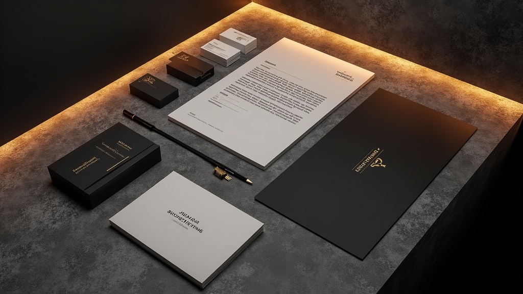
- Stationery designs (business cards, letterheads, envelopes)
- Digital application templates (social media, email signatures, presentations)
- Optional: photography direction, iconography, illustration style, motion guidelines
The scope of what you need depends on your business stage, industry, and how many touchpoints you're managing. A pre-revenue SaaS startup doesn't need the same package as a national retail chain opening 50 locations.
The Complete Brand Identity Deliverables List
Here's every deliverable you might encounter in a brand identity project. Not every project includes all of these -- I'll explain which tiers cover what in the cost section below.
| Category | Deliverables | Priority |
|---|---|---|
| Strategy | Brand positioning, audience personas, brand personality/voice, competitive audit | Foundation |
| Logo System | Primary logo, secondary mark, submark/favicon, logo variations (horizontal, stacked, icon-only), file formats (SVG, PNG, EPS, PDF) | Essential |
| Color Palette | Primary colors (2-3), secondary colors (2-4), neutral colors, exact Pantone/CMYK/RGB/HEX values, accessibility contrast ratios | Essential |
| Typography | Primary typeface, secondary typeface, web-safe fallbacks, type scale/hierarchy, licensing info | Essential |
| Brand Guidelines | Usage rules, clear space, minimum sizes, color application rules, do's and don'ts, voice & tone | Essential |
| Stationery | Business cards, letterhead, envelopes, invoice template, presentation deck | Standard |
| Digital Applications | Social media templates, email signature, website design system/UI kit, ad templates | Standard |
| Extended Assets | Iconography set, illustration style, photography art direction, pattern/texture library, motion/animation guidelines, packaging, signage, vehicle wraps | Premium |
Logo System Deliverables
A single logo file isn't a logo system. I can't stress this enough. If your designer hands you one PNG and calls it done, you've been shortchanged.
A proper logo system includes at minimum five variations:
- Primary logo -- Your main mark, usually a combination of icon and wordmark
- Secondary logo -- An alternate layout (horizontal if primary is stacked, or vice versa)
- Submark -- A simplified version for small spaces (think favicon, app icon, social avatar)
- Icon only -- The graphic element isolated from the wordmark
- Wordmark only -- The company name without the icon
Each variation should be delivered in:
- SVG -- Scalable for any size, essential for web
- PNG -- Transparent background, in multiple sizes (at least 500px, 1000px, 2000px wide)
- EPS/AI -- For print production
- PDF -- Universal sharing format
- Favicon formats -- ICO, 32x32 PNG, 180x180 Apple Touch icon
Color versions for each variation:
- Full color on light background
- Full color on dark background
- Single color (black)
- Single color (white/reversed)
Do the math and you're looking at 40-80+ individual files in a complete logo package. This is normal. This is what you're paying for.
Logo Usage Rules
Your guidelines should specify:
- Clear space -- The minimum breathing room around the logo (usually measured in units relative to the logo itself, like "the height of the letter 'o' on all sides")
- Minimum size -- The smallest the logo can appear while remaining legible. Industry standard is around 12mm wide for print and 35-50px wide for digital.
- Don'ts -- Stretching, rotating, recoloring, adding effects, placing on busy backgrounds. Include visual examples of each violation.
Color Palette Specifications
A color palette isn't "blue and white." It's a precise system with exact values that ensure consistency whether you're printing a business card in Tokyo or building a landing page in Toronto.
Here's what a properly specified color should look like:
Primary Blue
├── Pantone: 2935 C
├── CMYK: 100 / 46 / 0 / 0
├── RGB: 0 / 106 / 206
├── HEX: #006ACE
└── WCAG Contrast (on white): 4.63:1 (AA for large text)
Why all four formats? Because they serve different reproduction methods:
- Pantone -- Spot color printing (the most accurate for physical materials)
- CMYK -- Four-color process printing (brochures, packaging)
- RGB -- Screens (websites, apps, presentations)
- HEX -- Web-specific shorthand for RGB
A solid brand palette typically includes:
- 2-3 primary colors -- The dominant colors that define your brand
- 2-4 secondary colors -- Supporting colors for variety and hierarchy
- 3-5 neutrals -- Backgrounds, text colors, borders
- Functional colors -- Success (green), warning (yellow), error (red), info (blue) for digital products
I always push for accessibility contrast ratios to be documented right alongside the color values. In 2026, WCAG 2.2 AA compliance isn't optional -- it's a legal baseline in many jurisdictions. Your primary text color on your primary background color needs a contrast ratio of at least 4.5:1.
Typography System
Typography does more heavy lifting than most people realize. The right type system creates hierarchy, establishes tone, and makes content scannable without anyone consciously noticing.
A brand typography system includes:
Typeface Selection
- Primary typeface -- Used for headlines, key UI elements. This sets the personality.
- Secondary typeface -- Used for body text, long-form content. Needs to be highly readable.
- Monospace typeface (optional) -- For code, data, or technical content
- Web-safe fallback stack -- What loads if your custom fonts fail
Type Scale and Hierarchy
Your guidelines should define a clear hierarchy:
/* Example type scale -- this is the kind of thing
 your guidelines document should specify */
--font-size-xs: 0.75rem; /* 12px -- captions, labels */
--font-size-sm: 0.875rem; /* 14px -- secondary text */
--font-size-base: 1rem; /* 16px -- body text */
--font-size-lg: 1.125rem; /* 18px -- lead paragraphs */
--font-size-xl: 1.5rem; /* 24px -- H3 */
--font-size-2xl: 2rem; /* 32px -- H2 */
--font-size-3xl: 2.5rem; /* 40px -- H1 */
--font-size-4xl: 3.5rem; /* 56px -- Display */
Licensing
This is where people get burned. A font that's free for personal use might cost $500+ for a commercial web license. Your brand guidelines should document:
- The exact font names and weights included in the license
- License type (desktop, web, app, server)
- Number of pageviews/seats covered
- Where to access/download the fonts
- Renewal dates if applicable
Google Fonts remain the safest free option for web projects. If you're using a premium typeface from foundries like Klim, Grilli Type, or Commercial Type, budget $200-$2,000 for licensing depending on company size and usage scope.
Brand Guidelines Document
The brand guidelines document is the deliverable that holds everything together. Without it, your logo files and color swatches are just disconnected assets floating in a shared drive.
A solid guidelines document covers:
- Brand overview -- Mission, vision, values, positioning statement (1-2 pages)
- Logo usage -- All variations, spacing rules, minimum sizes, don'ts
- Color system -- Full palette with all format values
- Typography -- Typefaces, hierarchy, usage examples
- Photography/imagery direction -- Style, treatment, composition guidelines
- Voice and tone -- How the brand speaks, with written examples
- Application examples -- Real mockups showing the system in action
- File inventory -- Where to find every asset and what format to use when
The length varies wildly by tier. A $3K project might produce a 10-15 page PDF. A $50K enterprise project might deliver a 60-100+ page document or even a dedicated brand portal website.
McDonald's, for reference, specifies that their golden arches must maintain clear space equal to the width of one arch on all sides, and their red must be Pantone 485 C for print and RGB 255, 0, 0 for digital. That level of precision is what separates brands that stay consistent from brands that slowly drift into chaos.
Stationery and Print Collateral
Stationery might feel old-school, but it's still part of most brand identity projects -- especially for professional services, B2B companies, and any business that interacts with clients face-to-face.
Typical stationery deliverables:
- Business cards -- Print-ready files, usually two-sided, with bleed marks and trim guides
- Letterhead -- A4/US Letter, with header/footer layout, margins for content
- Envelope -- DL and C4 sizes, with window placement if needed
- With-compliments slip -- Still used in some industries
- Invoice/estimate template -- Often overlooked but a real brand touchpoint
- Presentation deck -- PowerPoint/Keynote/Google Slides master template with branded layouts
The stationery files should be delivered in print-ready format (CMYK, 300dpi, with bleeds) and also as editable templates so your team can customize content without breaking the design.
Digital Application Deliverables
This is where brand identity meets the real world for most modern businesses. Your digital applications are the touchpoints people interact with every single day.
Social Media Templates
- Profile picture/avatar (optimized per platform)
- Cover/banner images (LinkedIn, Facebook, X, YouTube)
- Post templates (square, story, carousel formats)
- Highlight covers (Instagram)
- HTML email signature
- Email newsletter template
- Transactional email template
Website Design System
For companies investing in a custom website, the brand identity project often feeds directly into a UI design system or component library. This is where we do a lot of work at Social Animal -- taking brand identity systems and translating them into headless CMS implementations and Next.js or Astro front-ends.
A website design system might include:
- Button styles and states
- Form element styling
- Card components
- Navigation patterns
- Spacing and grid system
- Component library (Figma or Storybook)
Ad Templates
- Google Display Network sizes (300x250, 728x90, 160x600, etc.)
- Social ad formats
- Retargeting banner templates
Cost Tiers Breakdown: $3K to $50K+
Here's where it gets real. I'm going to break down four tiers based on what I've seen agencies and freelancers charge in 2025-2026, and exactly what you should expect at each level.
| Tier | Budget Range | Timeline | Best For |
|---|---|---|---|
| Starter | $3,000 -- $7,000 | 3-5 weeks | Pre-revenue startups, side projects, MVPs |
| Professional | $7,000 -- $15,000 | 6-8 weeks | Funded startups, small businesses, local companies |
| Premium | $15,000 -- $30,000 | 8-12 weeks | Growth-stage companies, regional brands, series A+ startups |
| Enterprise | $30,000 -- $50,000+ | 12-16+ weeks | National/international brands, franchise systems, rebrand projects |
Starter Tier: $3,000 -- $7,000
What you get:
- Brand strategy: Brief questionnaire or 1-2 discovery calls
- Logo: Primary logo + 1-2 variations, basic file formats
- Color palette: 3-5 colors with HEX/RGB values
- Typography: 1-2 typeface recommendations (likely Google Fonts)
- Guidelines: 8-15 page PDF
- Stationery: Business card design only
- Digital: Basic social media avatar
What you don't get: Extensive research, multiple concept rounds, print-ready stationery, motion guidelines, custom iconography, or full digital templates.
Realistic expectations: You'll get a clean, professional foundation. It won't win design awards, but it'll serve you well for your first 1-2 years if you chose a good designer. Budget roughly 2-3 initial concepts with 2 rounds of revisions.
Professional Tier: $7,000 -- $15,000
What you get:
- Brand strategy: Workshop or deep-dive discovery session, competitive audit, positioning statement
- Logo: Full system (5+ variations), complete file package
- Color palette: Primary + secondary palette, all format values including Pantone
- Typography: Primary + secondary typefaces, type scale, licensing guidance
- Guidelines: 20-35 page document with usage examples
- Stationery: Business card, letterhead, envelope (print-ready)
- Digital: Social media templates, email signature, basic presentation template
This is the sweet spot for most businesses. You get a legitimate brand system that can scale. The strategy work means your visual identity is grounded in actual positioning, not just aesthetic preference.
Premium Tier: $15,000 -- $30,000
What you get:
- Brand strategy: Full discovery process, stakeholder interviews, audience research, brand architecture
- Logo: Complete system with responsive variations, animated logo version
- Color palette: Full system with accessibility documentation, extended palette for data visualization
- Typography: Custom type scale, web font implementation guide
- Guidelines: 40-60+ page document or digital brand portal
- Stationery: Full suite including presentation deck master, invoice templates, folder design
- Digital: Complete social media kit, email templates, website design system/UI kit in Figma, ad templates
- Extras: Photography art direction, basic iconography set (20-40 icons), brand illustration style
Budget allocation at this tier tends to follow:
- 40% design development
- 35% documentation and guidelines
- 25% application/implementation
Implementation timelines at this level run 8-12 weeks, and you should expect 3-5 initial concepts with 3+ revision rounds.
Enterprise Tier: $30,000 -- $50,000+
What you get: Everything in Premium, plus:
- Extensive primary research (surveys, focus groups, brand audits)
- Brand architecture for multi-product/multi-division companies
- Custom iconography system (60-100+ icons)
- Illustration system with multiple styles
- Motion/animation guidelines with example animations
- Sound/audio branding direction
- Environmental/signage design
- Packaging system (if applicable)
- Digital brand portal (interactive website, not just a PDF)
- Implementation support and team training sessions
- Brand launch strategy
At this level, you're typically working with a mid-size agency team: brand strategist, creative director, 1-2 designers, a copywriter, and possibly a motion designer. The timeline is 12-16+ weeks, sometimes longer for complex organizations.
How to Choose the Right Tier for Your Business
Here's my honest take after seeing hundreds of these projects:
Choose Starter if: You're pre-revenue, testing a concept, or bootstrapping. Get something professional enough to not embarrass you, then upgrade when you have traction and revenue.
Choose Professional if: You have paying customers, you're about to launch a proper website, or you're hiring your first marketing person. This tier gives them actual tools to work with.
Choose Premium if: You've raised a Series A, you're expanding into new markets, your current brand is actively holding you back, or you're about to invest significantly in a website build. If you're planning a headless website project with us -- the brand identity work feeds directly into the design system we'll build. Check our pricing page for how we structure those engagements.
Choose Enterprise if: You're a multi-location business, you have 50+ employees who all need to use the brand correctly, or your brand touches physical products, environments, and packaging.
Common Mistakes That Waste Your Brand Budget
Spending too much too early. If you haven't validated your business model yet, a $30K brand identity is a terrible investment. I've seen beautiful brands go to waste because the underlying business pivoted six months later.
Skipping strategy entirely. Jumping straight to "make me a logo" without defining who you're for and what you stand for leads to subjective, endless revision cycles. Even at the $3K level, some strategic framing saves everyone time and money.
Not planning for digital from the start. If 90% of your brand touchpoints are digital, your brand identity needs to be designed for screens first. Insist on seeing how the logo works at 16x16 pixels. Insist on contrast ratio documentation for your colors.
Forgetting about implementation. A brand guidelines PDF that sits in a Google Drive folder is worthless. Build the cost of implementing the brand -- updating your website, creating templates, training your team -- into your budget. Typically, implementation costs 50-100% of the identity design cost itself.
Having 37 decision-makers. Brand projects die in committee. Limit your approval group to 2-3 people maximum. When everyone has an opinion on whether the blue should be "more corporate" or "more approachable," you end up with beige.
If you're ready to take your brand identity into a digital build -- whether that's a Next.js website, an Astro-powered content site, or a full headless CMS architecture -- we'd love to chat about it.
FAQ
What deliverables should be included in a brand identity package?
At minimum, you should receive a logo system (primary logo plus 3-5 variations in multiple file formats), a color palette with exact Pantone/CMYK/RGB/HEX values, a typography system with at least a primary and secondary typeface, and a brand guidelines document that explains how to use everything correctly. Most packages also include business card design and basic social media templates. Anything beyond that -- presentation decks, iconography, photography direction, motion guidelines -- depends on your budget tier.
How much does a full brand identity cost in 2026?
Realistic pricing ranges from $3,000 for a basic starter package from a skilled freelancer to $50,000+ for an enterprise-level identity from a mid-size agency. The most common range for established small-to-medium businesses is $7,000 -- $15,000, which gets you a proper logo system, color and typography specifications, 20-35 page brand guidelines, stationery designs, and digital templates. Your investment should roughly match your business stage and the number of touchpoints your brand needs to cover.
What's the difference between brand identity and brand strategy?
Brand strategy is the thinking -- your positioning, target audience, personality, values, and competitive differentiation. Brand identity is the visual and verbal expression of that strategy -- your logo, colors, typography, voice, and design system. Strategy should always come first because it gives the design work a clear direction. Without strategy, you're just decorating.
How long does a brand identity project take?
Timelines range from 3-5 weeks for a starter project to 12-16+ weeks for an enterprise rebrand. The Professional tier ($7K-$15K) typically takes 6-8 weeks. The biggest timeline variable isn't the design work -- it's the feedback and approval process on your side. Projects with fast, decisive stakeholders finish weeks ahead of projects that get stuck in review cycles.
What file formats should my logo be delivered in?
You need SVG (scalable vector for web and any size), PNG (transparent background for digital use), EPS or AI (vector formats for print production), and PDF (universal sharing). Each format should be provided for every logo variation and in both color and single-color versions. You should also receive favicon-specific formats: ICO, 32x32 PNG, and 180x180 PNG for Apple devices. If your designer only gives you JPEGs, that's a red flag.
Do I need Pantone colors in my brand guidelines?
If you'll ever print physical materials -- business cards, brochures, packaging, signage -- then yes, you need Pantone references. Pantone is a standardized color matching system that ensures your printer in New York produces the same blue as your printer in Berlin. For purely digital brands, RGB and HEX values are sufficient, but it's still best practice to define Pantone values for future-proofing. Pantone books/licenses cost extra, so this is typically included from the Professional tier ($7K+) onward.
Should I hire a freelancer or an agency for brand identity?
For Starter and Professional tiers ($3K-$15K), a talented freelance designer or small studio can deliver excellent results -- often better than an agency at the same price point because you're paying for talent, not overhead. For Premium and Enterprise tiers ($15K+), you benefit from an agency team because the project requires multiple skill sets: strategy, design, copywriting, and sometimes motion or development. The key is reviewing their portfolio for projects similar to yours in scope and industry.
How often should a brand identity be updated?
A well-designed brand identity should last 5-10 years before needing a significant refresh. Minor updates -- adding new templates, extending the color palette for a new product line, updating photography style -- happen naturally as your business grows. A full rebrand should only happen when your business has fundamentally changed (new market, new audience, merger/acquisition) or when your current identity is actively hurting perception. If you're redesigning every 18 months, the original work wasn't strategic enough.